Wednesday, November 17, 2010

Final Project

     As of now, I plan for my final project to focus on the big idea of dreams and nightmares. One image will be about the dreams we have, and the other will be about nightmares. I am going to accomplish this my using photos from the Internet, and a few of my own to create 2 collaged images, one of dreams and one of nightmares. I will use many techniques to make the collages look somewhat mystical including layering effects, the smudge tool, and also the twist tool on the liquify filter. Both the dreams and nightmares will be "coming out" of a black silhouetted head, that I will paint in black using a real image as a guide. My focus will be on the "American dream" as the dream side, and the reality of what it has become on the nightmare side. I could see this being used as an artistic piece, or maybe some kind of campaign.
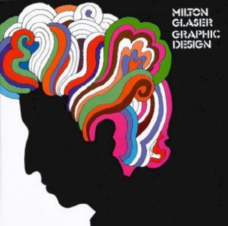
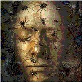
   The three things that influenced me on this idea was the artwork of the artist I previously studied, Milton Glaser, the artwork of Catherine McIntyre, and the culture of America. I was very inspired by Milton Glaser's Bob Dylan CD cover. I loved the simplicity of a black silhouette, so this is how I chose to use a black silhouette in my work as well. Catherine McIntyre's work is based off of dreams and nightmares, looking at her work influenced me to also use this Big Idea, although in a different manner. Finally, in America itself, we place much emphasis on achieving the American Dream and what that dream consists of. Upon reflection, I wondered if the American Dream really is what we think it is and what it could actually turn into. We dream of the house with a white picket fence, of a happy family, of earning money. The reality is some of these things are not always so easy to achieve. With the recession, people have lost their jobs, their families, their houses. What is it that we are really searching for? This is what my overall inspiration is for this piece.


Catherine McIntyre
http://cmci.websign.ru/
nightmares
http://www.dreams.ca/nightmares.htm

Milton Glaser:
http://www.poster-books.com/images/milton-glaser-graphic-design.jpg

Tuesday, November 2, 2010

2 Artisits


 Claude Monet was the first artist I chose. A few of his works of art are pictured above. Monet's work has always appealed to me because of his impresisonist style and his subject matter. I love how he uses so many colors and blends them together to create something that first most people don't see as anything. It is inspiring to me because he invented a new style of art and was able to create exquistely detailed pieces by smartly using different brush strokes and color. I feel that in the series of images I chose above, Monet's big idea was conicidentally also time. He painted this bridge as seasons changed, as years past, and in different times of the day. The last image is very impressionistic because it was painted towards the end of Monet's life and he began to lose his vision. He continually used the same bridge as his subject matter, but painted it in different times. His artwork will help me in my creation because it shows that I'm not limited when it comes to subject matter. I don't need to do use many different images to represent one idea, but instead can use one very representative image to show the Big Idea. I can also be inspired by nature and outdoors as a subject matter, whereas before i was only thinking about objects and people.

 http://www.robinurton.com/history/Impressionism/MonetBridge.jpg
http://www.ibiblio.org/wm/paint/auth/monet/last/monet.japanese-bridge.jpg
http://www.canvasreplicas.com/images/Water%20Garden%20and%20Bridge%20Claude%20Monet.jpg


The above images were made by Milton Braser, a famous graphic designer. I really enjoy the simplicty and boldness of his work. It is not overwhelmed with techniques and is very graphic. It's hard to be so simple yet still show a great design and I think he did that. I feel that his Big Idea may be showing culture. He made the famous Bob Dylan CD cover, who was a pop culture icon. The extremely famous I heart NYC design is cultural in that NYC is a metropolitan mecca, and so many people value the city. The Aretha design also relates to pop culture since Aretha Franklin was another famous singer and pop culture icon. His work is inspiring to me because it looks like he created his own orginial font, and also because the designs pop out at you and instantly capture your attention. They are simple, yet beautiful. I feel that by looking at his designs and artwork, I'm inspired to really focus on one thing and do it in a graphic way instead of overwhelming myself with technical aspects and really making my designs elaborate. His artwork shows me that by carefully playing with colors and boldness, you can still achieve a realistic and inspiring look.

https://blogger.googleusercontent.com/img/b/R29vZ2xl/AVvXsEhULQoibvX5dAknjr1488MapnDo8zbxuhejHb0IE4SvGkXpvBABJjfgBwS_1pl1s-q2HeWZksGArQMmXVSWt7cy8IdPZ7G6sU4LSKWhPbRpQHJyN6CJBJf244tk4NKgEUvjz7VGuQI7eLg/s400/Milton+Glaser+-+ilovenewyork.jpg
http://www.101bananas.com/art/dylan4.jpg
http://blog.iso50.com/wp-content/uploads/2009/02/274063398_5dfed4d382_o-449x612.jpg