Wednesday, December 1, 2010

Final Evaluation

Over the course of this class, I feel that I have really grown as an artisitc graphic designer. Prior to this class, I have had 2 years of Photoshop experience, so I feel I did know a lot of techniques and how to use Photoshop when I started this class. This class, however, was able to teach me more about Photoshop, and also I feel that it really helped in developing a more creative and artisitc perspective in creating my work. In my previous classes we learned many techniques, but we were usually always assigned projects with guidelines, and while we developed our own ideas, it was usually not much of an extensive thinking process because we had so much to work off of. In this class, I really had to think outside of the box and dig deeper to think of creative ways to show messages through my artwork. I had never considered Big Ideas before, and how they are very important to developing your art. My first few pieces from the quizzes were relatively straightforward-- for the magazine cover (pictured below) and the selections quiz (also pictured below), I followed the criteria of the project and just tried to show off good photoshoping skills. When it came to start the Diptych process, I began to realize how important it was to think of an orginal idea, and how I could show it, instead of just creating a good Photoshop piece. I feel that my midterm (below) shows a great improvement on how I learned to incorporate meaning into my artwork. I spent a lot of time developing an idea, and figuring out how I could best represent this. It was a tough process, but I feel that by the end I really showed that I could create great meaning with my midterm of the concept of the change of time. In my final, I also developed the big idea of dreams and nightmares (below), and really thought of a creative way of how I could show what dreams and nightmares meant to me. I now have a much better understanding of what a Big Idea is, and how it is very important to think of meanings and messages in creating artwork.

layers quiz

 selections quiz

                                                                           diptych

                                                                             final

Wednesday, November 17, 2010

Final Project

     As of now, I plan for my final project to focus on the big idea of dreams and nightmares. One image will be about the dreams we have, and the other will be about nightmares. I am going to accomplish this my using photos from the Internet, and a few of my own to create 2 collaged images, one of dreams and one of nightmares. I will use many techniques to make the collages look somewhat mystical including layering effects, the smudge tool, and also the twist tool on the liquify filter. Both the dreams and nightmares will be "coming out" of a black silhouetted head, that I will paint in black using a real image as a guide. My focus will be on the "American dream" as the dream side, and the reality of what it has become on the nightmare side. I could see this being used as an artistic piece, or maybe some kind of campaign.
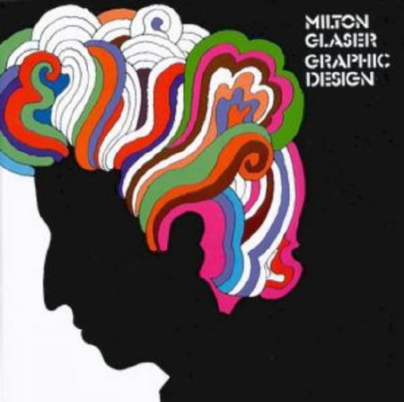
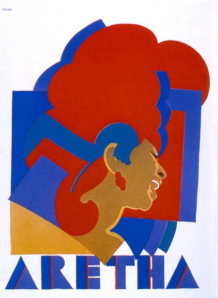
   The three things that influenced me on this idea was the artwork of the artist I previously studied, Milton Glaser, the artwork of Catherine McIntyre, and the culture of America. I was very inspired by Milton Glaser's Bob Dylan CD cover. I loved the simplicity of a black silhouette, so this is how I chose to use a black silhouette in my work as well. Catherine McIntyre's work is based off of dreams and nightmares, looking at her work influenced me to also use this Big Idea, although in a different manner. Finally, in America itself, we place much emphasis on achieving the American Dream and what that dream consists of. Upon reflection, I wondered if the American Dream really is what we think it is and what it could actually turn into. We dream of the house with a white picket fence, of a happy family, of earning money. The reality is some of these things are not always so easy to achieve. With the recession, people have lost their jobs, their families, their houses. What is it that we are really searching for? This is what my overall inspiration is for this piece.


Catherine McIntyre
http://cmci.websign.ru/
nightmares
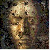
http://www.dreams.ca/nightmares.htm

Milton Glaser:
http://www.poster-books.com/images/milton-glaser-graphic-design.jpg

Tuesday, November 2, 2010

2 Artisits


 Claude Monet was the first artist I chose. A few of his works of art are pictured above. Monet's work has always appealed to me because of his impresisonist style and his subject matter. I love how he uses so many colors and blends them together to create something that first most people don't see as anything. It is inspiring to me because he invented a new style of art and was able to create exquistely detailed pieces by smartly using different brush strokes and color. I feel that in the series of images I chose above, Monet's big idea was conicidentally also time. He painted this bridge as seasons changed, as years past, and in different times of the day. The last image is very impressionistic because it was painted towards the end of Monet's life and he began to lose his vision. He continually used the same bridge as his subject matter, but painted it in different times. His artwork will help me in my creation because it shows that I'm not limited when it comes to subject matter. I don't need to do use many different images to represent one idea, but instead can use one very representative image to show the Big Idea. I can also be inspired by nature and outdoors as a subject matter, whereas before i was only thinking about objects and people.

 http://www.robinurton.com/history/Impressionism/MonetBridge.jpg
http://www.ibiblio.org/wm/paint/auth/monet/last/monet.japanese-bridge.jpg
http://www.canvasreplicas.com/images/Water%20Garden%20and%20Bridge%20Claude%20Monet.jpg


The above images were made by Milton Braser, a famous graphic designer. I really enjoy the simplicty and boldness of his work. It is not overwhelmed with techniques and is very graphic. It's hard to be so simple yet still show a great design and I think he did that. I feel that his Big Idea may be showing culture. He made the famous Bob Dylan CD cover, who was a pop culture icon. The extremely famous I heart NYC design is cultural in that NYC is a metropolitan mecca, and so many people value the city. The Aretha design also relates to pop culture since Aretha Franklin was another famous singer and pop culture icon. His work is inspiring to me because it looks like he created his own orginial font, and also because the designs pop out at you and instantly capture your attention. They are simple, yet beautiful. I feel that by looking at his designs and artwork, I'm inspired to really focus on one thing and do it in a graphic way instead of overwhelming myself with technical aspects and really making my designs elaborate. His artwork shows me that by carefully playing with colors and boldness, you can still achieve a realistic and inspiring look.

https://blogger.googleusercontent.com/img/b/R29vZ2xl/AVvXsEhULQoibvX5dAknjr1488MapnDo8zbxuhejHb0IE4SvGkXpvBABJjfgBwS_1pl1s-q2HeWZksGArQMmXVSWt7cy8IdPZ7G6sU4LSKWhPbRpQHJyN6CJBJf244tk4NKgEUvjz7VGuQI7eLg/s400/Milton+Glaser+-+ilovenewyork.jpg
http://www.101bananas.com/art/dylan4.jpg
http://blog.iso50.com/wp-content/uploads/2009/02/274063398_5dfed4d382_o-449x612.jpg

Sunday, October 24, 2010

Tutorial

Tutorial I chose: http://www.worth1000.com/tutorials/161615/removing-things-from-your-pictures-with-clone

I saved the original dog image to use as my starting point.


First, I began with cloning the dogs head. Using the tips of the tutorial, I selected a soft brush to clone with and took from only the blurry areas around the dogs head, and not sharper selections from the foreground.

 Here I have now cloned the top half of the dogs body which is the most blurred part. In the tutorial, the writer seemed to make patterns with the clone tool, then go back later and fix them. Instead, I've chosen to select random areas as I go, so I don't have to go back and choose random spots in the end.

Now I have begun to work on cloning the bottom half of the image. This is a bit more difficult because the image quality at the bottom is sharper and the softness of the brush makes it hard to replicate sharply, but if the clone is not soft, it looks choppy. I have been working more slowly on this section to try and create a realistic look. I also decreased the brush size in order to capture the details of the sharpness better.

This is the final image as a screenshot.


This is the final image saved as a JPEG.

Sunday, October 10, 2010

Shepard Fairey

I chose Shepard Fairey. He is a modern graphic designer who uses the computer to create his works. He is best known for the Obama Hope poster that he created.


     The denotations of the above artwork show a smoke cloud puffing up from the black ground. The background is a bright red with thin stripes curving slightly up it. There are 4 black planes in the background to the right of the smoke cloud. Underneath the smoke cloud in cursive script it says "Greetings" then in an all caps sans serif font it says "FROM" then in another all-caps, but very unique and original font it says "IRAQ". Underneath that in a plain all-caps font it says "ENJOY A CHEAP HOLIDAY IN OTHER PEOPLE'S MISERY". The whole ground is black and there are slight hills on either side of the smoke cloud. On the left of the smoke cloud there's an oil rig, also in black. On the right side of the smoke cloud there are 3 camels. The smoke cloud itself is an off white pinkish beige color, but is outlined in black and has black lines throughout.
     The connotations of this image are fairly obvious. The image displays an overall sarcastic tone and clearly does not support the war in Iraq. The oil rigs in the background represent the fight for oil that is in the natural resources of Iraq. The camels on the opposing side of the oil rig contrast the harshness of the oil rig. The camels are a part of Iraq's culture and history, and putting them in the setting with the oil rig, planes, and smoke cloud makes them stand out as the only part of true Iraqi culture left. The main focus of the image, the smoke cloud, represents bombing and destruction of the land and also violence of the war. The text is also sending a strong message that looking for oil and destroying the land and resources is the "cheap holiday" and it is causing "other people's misery." The "Greetings from Iraq" is somewhat sarcastic, saying that no one would actually like to be sending greetings from Iraq. It can be said that the artist, Shepard Fairey, does not support the war in Iraq and feels it is a mistake, just by analyzing the connotations and denotations of the image.


The next image I chose is the extremely popular Obama Hope poster that Fairey created during the 2008 election campaign.
   The image is an actual photograph of Barrack Obama that has been manipulated in computer programs. It is a close up of Obama's face but also shows the top half of his suit. He appears to be looking up at something off into the distance. The whole image consists of only red, white, and blue shades. All of the outlining on Obama's face is done in a dark blue color, as is his suit jacket and the bottom portion of the image. His face is filled in with light blue, off-white, and red. His tie and the right side of the image are red, while the left side is light blue, and the middle of his face and also his shirt are filled with white. Underneath the image of Obama there is the word HOPE in a bold, all-caps, sans serif font. It is colored light blue. Directly above the E there is Obama's logo which is a circle with red and white stripes on the bottom.
  The image connotes overall support for Obama. The word "HOPE" represents this the best, because it is implying the Obama represents hope for America. Red, white, and blue are the colors of the American flag, and by only using these colors, Fairey wants to say that Obama is patriotic, and for the better of America and represents America. He strategically used the colors on Obama's face in the red, white, and blue order, because that is the order we say the colors in patriotic songs and such. The added detail of Obama's campaign logo is again to just show support for Obama. It is fair to say that Shepard Fairey is an Obama supporter.


SOURCES:
Obama Hope Poster  http://markbrand.wordpress.com/category/political-art/
"Greeting from Iraq" http://www.portrait.gov.au/exhibit/fairey/12.html?pagenum
**I already knew of the artist so I did not look him up on the internet, only his artwork**